Color is one of the most powerful yet underestimated tools in design, marketing, and everyday communication. The shades we encounter daily influence our emotions, decisions, and even our physical responses in ways we rarely acknowledge consciously.
Understanding color psychology opens doors to more effective branding, improved user experiences, and deeper cross-cultural awareness. From the saturation levels that evoke different intensities of feeling to the cultural contexts that completely reframe color meanings, mastering this knowledge transforms how we communicate visually with the world around us.
🎨 The Fundamental Science Behind Color Perception
Color perception begins in the eye but culminates in the brain, where wavelengths of light transform into the rich visual experiences we call colors. The human eye contains specialized photoreceptor cells called cones, which detect different wavelengths corresponding to red, green, and blue light. These signals travel through the optic nerve to the visual cortex, where the brain interprets and assigns meaning to these wavelengths.
What makes color psychology particularly fascinating is that our responses extend beyond mere visual processing. Research has demonstrated that color exposure triggers the limbic system, the emotional center of the brain, producing measurable physiological changes including heart rate variations, hormone releases, and even shifts in blood pressure.
The wavelength of light itself carries inherent qualities. Longer wavelengths like red and orange are associated with warmth and energy, while shorter wavelengths such as blue and violet connect to coolness and calm. This physical reality forms the foundation upon which cultural and personal associations build additional layers of meaning.
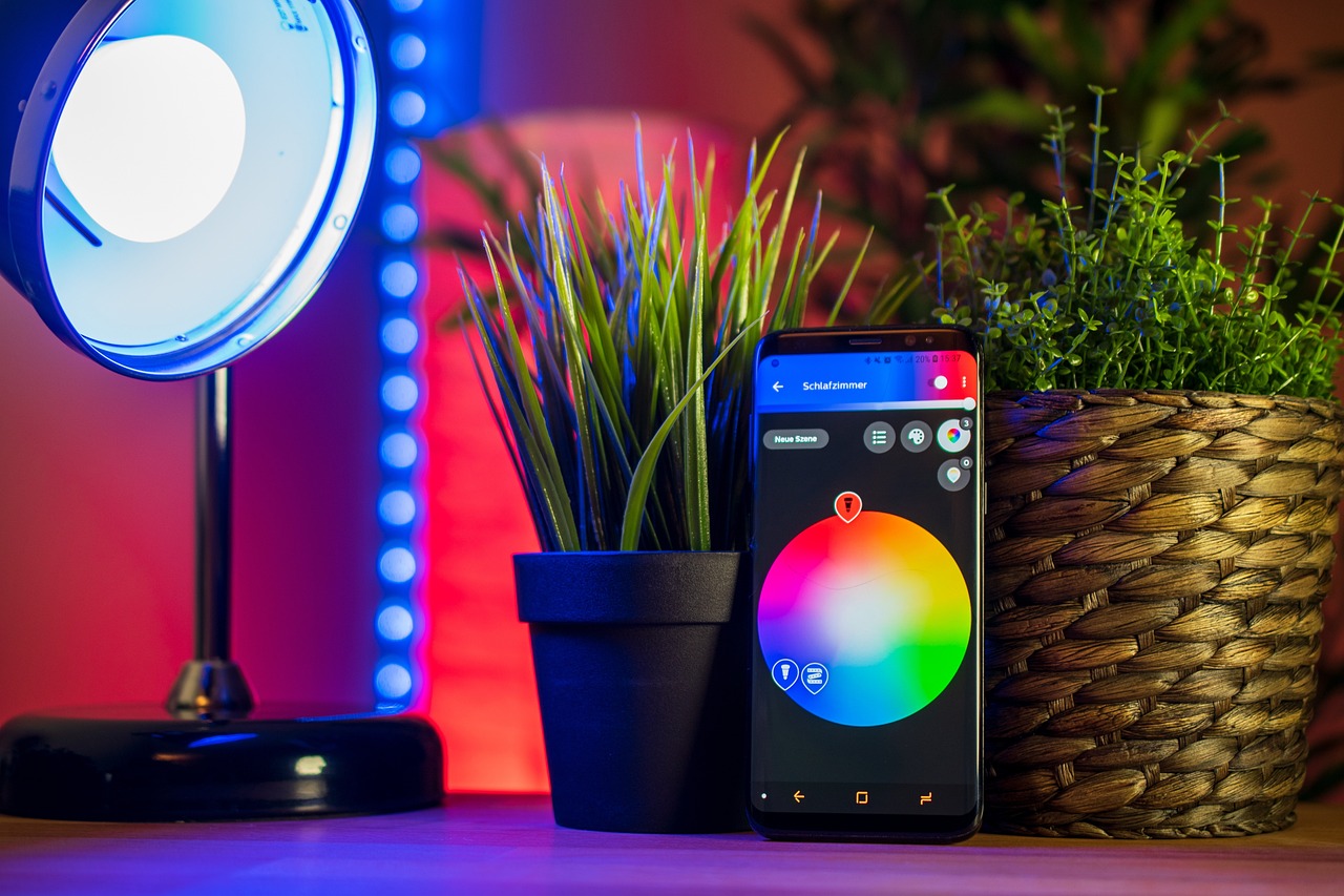
Understanding Hue, Saturation, and Brightness
To truly grasp color psychology, we must first understand the three fundamental properties that define any color: hue, saturation, and brightness (also called value or lightness).
Hue: The Color Family Identity
Hue represents what we commonly think of as “color” itself—red, blue, green, yellow, and all the variations between them on the color wheel. Each hue carries distinct psychological associations that have been studied extensively across populations and contexts.
Red typically evokes passion, urgency, excitement, and danger. Blue tends to communicate trust, calm, professionalism, and stability. Green connects with nature, growth, health, and harmony. Yellow radiates optimism, energy, creativity, and caution. These associations form the baseline of color communication, though they’re modified significantly by the other two properties.
Saturation: The Intensity Factor
Saturation refers to the purity or intensity of a color—how vibrant or muted it appears. A fully saturated red is bold and vivid, while a desaturated red becomes pink or eventually gray. This property dramatically impacts emotional response.
Highly saturated colors demand attention and convey energy, excitement, and confidence. They’re stimulating and can even feel aggressive or overwhelming in excess. Brands targeting youth markets or conveying innovation frequently employ high saturation to capture attention and communicate vitality.
Desaturated colors, conversely, feel sophisticated, subtle, and calming. They suggest maturity, elegance, and restraint. Luxury brands often favor muted palettes precisely because they communicate refinement rather than shouting for attention.
Brightness: The Emotional Thermostat
Brightness determines how light or dark a color appears. This property influences the emotional weight of any hue. Bright colors feel optimistic, accessible, and friendly, while dark colors convey seriousness, mystery, or luxury.
A bright blue feels playful and approachable—think social media platforms aimed at broad audiences. That same blue hue, darkened significantly, becomes authoritative and trustworthy—perfect for financial institutions and corporate communications.
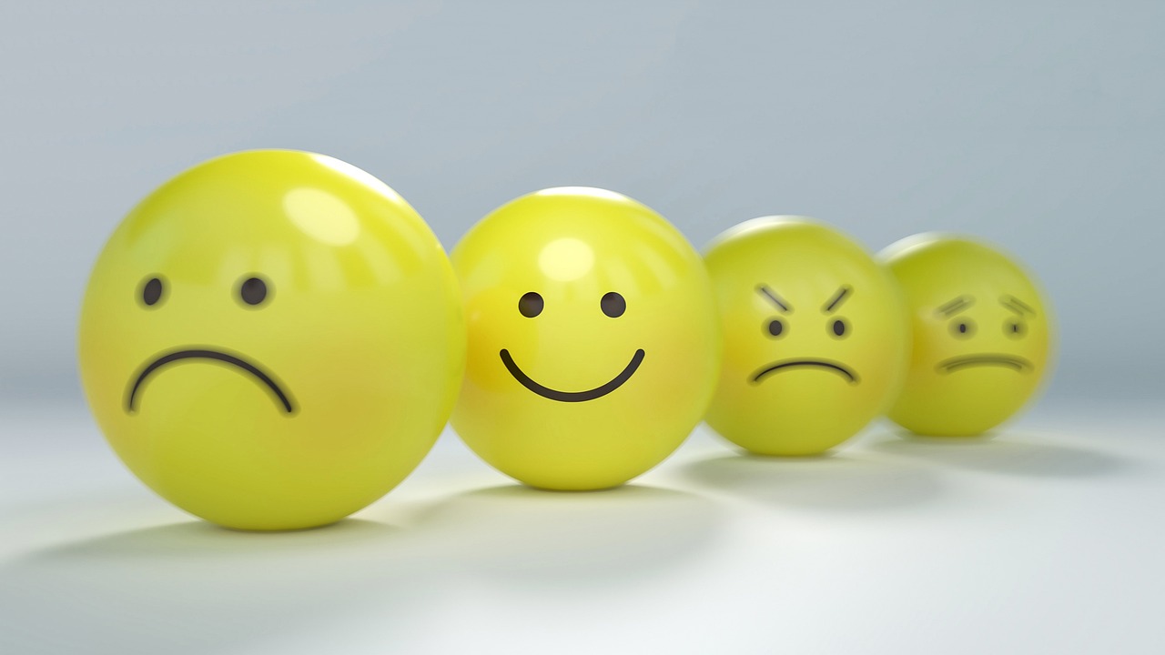
🧠 How Different Colors Influence Emotions and Behavior
Decades of psychological research have mapped consistent patterns in how specific colors influence human emotion and behavior, though individual and cultural variations always exist.
Red: The Activator
Red increases heart rate and creates a sense of urgency. It’s no accident that clearance sales feature red signs or that fast-food chains incorporate red extensively in their branding. This color stimulates appetite, encourages quick decisions, and draws immediate attention.
In contexts requiring caution or signaling danger, red serves an evolutionary purpose, triggering heightened alertness. However, in romantic or passionate contexts, red symbolizes love, desire, and intensity. The context determines whether red signals “stop and pay attention” or “approach with passion.”
Blue: The Trust Builder
Blue consistently ranks as the world’s most popular color and for good reason. It lowers heart rate, reduces anxiety, and promotes feelings of security and reliability. This explains its dominance in corporate branding, especially within technology, finance, and healthcare sectors.
Lighter blues feel refreshing and liberating, often associated with sky and water. Darker blues convey professionalism, expertise, and dependability. The versatility of blue across its brightness range makes it incredibly adaptable to various communication needs.
Green: The Balanced Harmonizer
Green sits at the center of the visible spectrum, requiring no eye adjustment to process, making it literally the most restful color for human vision. It symbolizes growth, renewal, health, and environmental consciousness.
Brands emphasizing natural ingredients, sustainability, or wellness gravitate toward green. Financial institutions also employ green to represent prosperity and growth. The color’s association with “go” signals (traffic lights) adds connotations of permission and forward movement.
Yellow: The Attention Catalyst
Yellow is the most visible color in daylight, which is why it’s used for warning signs and highlighters. It stimulates mental activity, generates optimism, and captures attention more effectively than any other hue.
However, yellow requires careful handling. Overuse can create anxiety or visual fatigue. In its golden tones, yellow conveys warmth and premium quality, but in its brightest manifestations, it signals caution or demands immediate notice.
Purple: The Luxury Communicator
Historically expensive to produce as a dye, purple retains associations with royalty, luxury, and exclusivity. It also connects strongly with creativity, spirituality, and imagination, making it popular in beauty products and creative industries.
Lighter purples (lavender) feel calming and romantic, while deeper purples communicate sophistication and mystery. This color’s relative rarity in nature contributes to its perception as special and distinctive.
Orange: The Friendly Energizer
Orange combines red’s energy with yellow’s happiness, creating a warm, enthusiastic, and accessible feeling. It’s less aggressive than red but more energetic than yellow, making it perfect for calls-to-action that encourage without pressuring.
This color communicates affordability, creativity, and adventure. It’s particularly effective in targeting younger demographics and conveying playfulness without sacrificing visibility.
🌍 Cultural Dimensions: How Geography Reshapes Color Meaning
Perhaps nothing illustrates color psychology’s complexity more than cultural variation. A color that symbolizes joy in one culture might represent mourning in another, making cultural awareness essential for global communication.
White: Purity or Mourning?
In Western cultures, white symbolizes purity, innocence, and cleanliness—hence its dominance in weddings, medical environments, and minimalist design. However, in many Asian cultures, including China, India, and Japan, white is the traditional color of mourning and funerals.
This stark contrast demonstrates why global brands must adapt color strategies regionally. A pristine white package signaling purity in New York might inadvertently suggest death in Shanghai.
Red: Luck or Danger?
While red signals danger and caution in many Western contexts, it represents luck, prosperity, and celebration throughout much of Asia. Chinese New Year decorations feature red prominently, and red envelopes contain monetary gifts for auspicious occasions.
In South Africa, red is associated with mourning, while in Russia, it historically connected with beauty and communism. These variations require careful consideration in international marketing and design.
Yellow: Happiness or Betrayal?
Yellow’s meanings vary dramatically across cultures. In Western contexts, it typically represents happiness and optimism. In Japan, it symbolizes courage and nobility. However, in some European contexts, yellow historically represented betrayal and cowardice.
In Latin American cultures, yellow often connects with death and mourning, paired with marigolds during Day of the Dead celebrations. These associations dramatically affect how color palettes are received in different markets.
Green: Growth or Infidelity?
While green universally connects with nature, its secondary meanings diverge significantly. In Muslim cultures, green holds sacred significance as the color of paradise. In Western contexts, green can represent envy or inexperience (“green with envy” or being “green” at something).
Indonesia traditionally associates green with forbidden or dangerous areas, while Ireland embraces it as a national symbol. These nuances influence everything from product packaging to website design for regional audiences.
Practical Applications: Color Psychology in Action
Understanding color psychology theory means little without practical application. Here’s how these principles manifest in real-world contexts.
💼 Branding and Logo Design
Successful brands choose colors that align with their identity and target audience expectations. Tech companies favor blue for trustworthiness (Facebook, LinkedIn, Twitter). Luxury brands employ black for sophistication (Chanel, Prada). Food brands use red and yellow to stimulate appetite (McDonald’s, Coca-Cola).
The most effective brand colors create immediate recognition while communicating core values. Think of Tiffany’s distinctive blue, which has become so synonymous with luxury jewelry that the company trademarked the specific shade.
🛍️ E-commerce and Conversion Optimization
Online retailers strategically deploy color to influence purchasing behavior. Red and orange buttons typically outperform other colors for “Add to Cart” or “Buy Now” actions because they create urgency and demand attention.
Background colors significantly impact perceived value. White backgrounds suggest affordability and accessibility, while black backgrounds communicate luxury and exclusivity. E-commerce sites carefully select palette choices to align with their positioning strategy.
🏥 Healthcare and Wellness Environments
Medical facilities increasingly recognize color’s impact on patient outcomes. Blue and green dominate healthcare design because they reduce anxiety and lower blood pressure. Waiting rooms featuring these colors report calmer patients and reduced perceived wait times.
Conversely, energizing colors like orange appear in pediatric areas to create friendlier, less intimidating environments for children. Color choices in healthcare aren’t merely aesthetic—they’re therapeutic tools.
🎓 Educational Spaces and Learning
Schools and learning environments use color psychology to enhance focus and creativity. Blue improves concentration for analytical tasks, while yellow stimulates creative thinking. Many modern classrooms incorporate both, using blue in areas designated for focused work and yellow in collaborative, creative zones.
Red increases attention to detail but can also induce stress, making it useful sparingly for highlighting critical information but problematic as a dominant color in study spaces.
🎯 Strategic Color Selection: A Framework
Choosing colors strategically requires balancing multiple factors. Here’s a practical framework for color decision-making:
- Define your core message: What emotion or value do you want to communicate? Match color associations to your intended message.
- Know your audience: Consider demographic preferences, cultural backgrounds, and industry expectations.
- Assess the context: Where will people encounter your colors? Digital screens display colors differently than print materials.
- Consider competitor positioning: Sometimes differentiation matters more than following category norms.
- Test and validate: Color preferences vary individually, so user testing provides invaluable insight beyond theoretical associations.
- Balance saturation and brightness: Don’t focus solely on hue; adjust intensity and value to refine emotional impact.
The Neuroscience Connection: Why Color Works
Recent neuroscience research illuminates the biological mechanisms behind color psychology. Functional MRI studies reveal that different colors activate distinct brain regions beyond the visual cortex.
Warm colors (red, orange, yellow) activate the amygdala more intensely, triggering emotional responses and increasing arousal. Cool colors (blue, green, purple) show greater activity in areas associated with calm reflection and rational thought.
This neurological reality explains why color choices genuinely affect mood and behavior—it’s not merely cultural conditioning but reflects hardwired neural pathways that evolution has shaped over millennia.
Advanced Techniques: Color Combinations and Harmony
Individual colors matter, but combinations create context and complexity. Color harmony principles guide effective palette creation.
Complementary Colors: Maximum Contrast
Colors opposite each other on the color wheel (red-green, blue-orange, yellow-purple) create vibrant, high-energy combinations. They demand attention but can fatigue the eye if overused. These pairs work brilliantly for highlighting specific elements against contrasting backgrounds.
Analogous Colors: Smooth Harmony
Colors adjacent on the color wheel create peaceful, harmonious combinations. Blue-green-teal or red-orange-yellow feel naturally cohesive and easy to process visually. These palettes communicate unity and flow, ideal for creating comfortable, approachable experiences.
Triadic Colors: Balanced Vibrancy
Three colors equally spaced on the color wheel create vibrant yet balanced combinations. Red-yellow-blue or orange-green-purple offer visual interest without overwhelming viewers. Many successful brand identities employ triadic schemes for their dynamic equilibrium.
🔮 Emerging Trends and Future Directions
Color psychology continues evolving as technology enables new applications and research reveals deeper insights. Digital interfaces allow dynamic color adaptation based on user behavior, time of day, or even detected emotional states.
Personalization represents the frontier of color psychology application. Imagine interfaces that adjust color schemes based on individual preferences and measured responses, optimizing emotional impact uniquely for each user.
Augmented reality and virtual environments expand color possibilities beyond physical constraints, allowing designers to experiment with impossible color combinations and psychologically optimize virtual spaces in ways physical design never could.
Maximizing Color’s Influence: Final Strategies
To harness color psychology effectively, approach it as both science and art. Understand the research-backed principles, but remain flexible enough to adapt based on specific contexts, audiences, and objectives.
Test assumptions through A/B testing and user feedback. What works theoretically might not resonate with your specific audience. Color preferences vary by generation, geography, and individual personality, making validation essential.
Remember that color never operates in isolation. Typography, imagery, layout, and content interact with color choices to create holistic experiences. The most sophisticated color strategies consider these relationships rather than treating color as an independent variable.
Stay informed about cultural sensitivities, especially when communicating across borders. What succeeds domestically might fail internationally without thoughtful adaptation to local color meanings and preferences.
Finally, recognize that color psychology provides powerful tools but not absolute rules. Creative innovation often emerges from thoughtfully breaking conventions once you understand them deeply enough to know when and how to deviate effectively.
The power of color psychology lies not in rigid formulas but in understanding the complex interplay of hue, saturation, brightness, culture, and context. Master these elements, and you unlock unprecedented influence over perception, emotion, and behavior—transforming ordinary communications into extraordinary experiences that resonate at the deepest psychological levels.