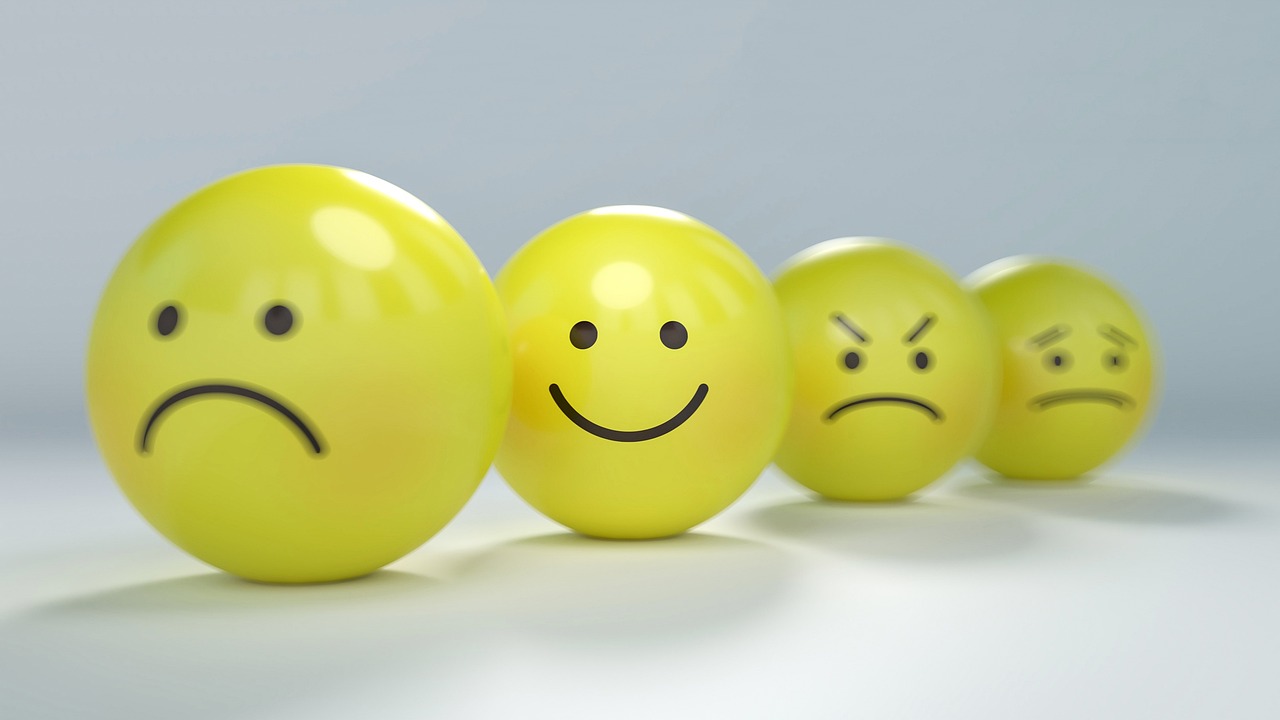
The colors surrounding us hold immense power over our emotional state, productivity, and overall well-being. Understanding how to harness this connection can transform not just your physical environment, but your entire mental landscape.
Every day, we navigate through spaces filled with colors, yet most of us remain unaware of their profound psychological impact. From the calming blues of a bedroom to the energizing yellows of a workspace, each hue communicates directly with our subconscious mind, influencing our mood, focus, and energy levels in ways we’re only beginning to understand.
🎨 The Science Behind Color Psychology and Emotional Resonance
Color psychology isn’t merely an artistic concept—it’s grounded in neuroscience and physiological responses. When light wavelengths enter our eyes, they trigger specific reactions in our brain’s limbic system, the region responsible for emotions, memories, and behavioral patterns. This automatic response happens before conscious thought even enters the equation.
Research conducted at the University of British Columbia revealed that blue lighting increases creative thinking by 50%, while red environments enhance attention to detail by activating our fight-or-flight response. These findings demonstrate that color-mood synchronization isn’t pseudoscience—it’s a measurable phenomenon with practical applications for everyday life.
The retina contains specialized photoreceptor cells called intrinsically photosensitive retinal ganglion cells (ipRGCs) that communicate directly with brain regions controlling circadian rhythms, alertness, and mood regulation. This biological pathway explains why certain colors can make us feel energized while others promote relaxation, regardless of cultural background or personal preference.
Understanding Your Personal Color-Mood Profile
While general color principles apply universally, individual responses vary based on personal experiences, cultural associations, and even genetic factors. Creating a personalized color-mood profile requires self-observation and intentional experimentation with different hues in your environment.
Begin by tracking your emotional state in various colored environments throughout your day. Notice how you feel in your blue-walled office versus the warm terracotta tones of your favorite café. Document these observations for at least two weeks, noting patterns in your energy levels, creativity, stress responses, and overall mood.
Key Questions for Building Your Profile
- Which colors make you feel most energized and motivated to tackle challenging tasks?
- What hues help you unwind and release accumulated stress after demanding days?
- Are there specific colors that enhance your concentration during focused work?
- Which color combinations create feelings of harmony and balance in your space?
- Do certain colors trigger negative emotional responses or uncomfortable memories?
Strategic Color Placement for Different Life Areas 🏠
Once you understand your color-mood relationship, strategic implementation becomes crucial. Different areas of your life require distinct emotional states, and your environment should support these varying needs through intentional color choices.
Workspace Optimization for Peak Performance
Your work environment demands colors that enhance focus, stimulate creativity, and maintain sustained energy without causing agitation. Blue tones activate the prefrontal cortex, improving analytical thinking and problem-solving abilities. Incorporating accent elements in yellow stimulates optimism and innovation, perfect for brainstorming sessions and creative projects.
Avoid overwhelming red in workspaces, as prolonged exposure increases cortisol levels and can lead to burnout. Instead, use red sparingly as an accent color for tasks requiring intense attention to detail or when you need a quick energy boost during afternoon slumps.
Bedroom Sanctuaries for Restorative Sleep
Sleep quality directly correlates with bedroom color schemes. Cool tones like soft blues, gentle greens, and muted lavenders lower heart rate and blood pressure, preparing your body for deep, restorative sleep. A study by Travelodge found that people sleeping in blue bedrooms averaged seven hours and 52 minutes of sleep—the most of any color tested.
Warm neutrals like beige, cream, and soft gray create cocoon-like environments that feel safe and comfortable. Avoid bright, saturated colors in sleeping areas, as they stimulate brain activity and suppress melatonin production, the hormone essential for regulating sleep-wake cycles.
Social Spaces That Foster Connection
Areas designed for gathering and socializing benefit from warm, inviting colors that encourage communication and emotional openness. Terracotta, warm coral, and golden yellow create welcoming atmospheres that make guests feel comfortable and valued. These hues stimulate appetite and conversation, making them ideal for dining rooms and entertainment areas.
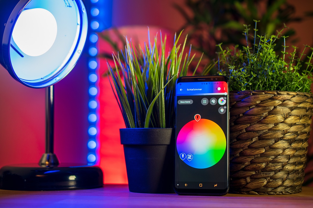
Dynamic Color-Mood Synchronization Through Technology ✨
Modern technology enables real-time color adjustments based on your current emotional needs and daily rhythms. Smart lighting systems allow you to shift your environment’s color temperature throughout the day, mimicking natural sunlight patterns that support optimal circadian rhythm function.
Programmable LED systems can transition from energizing cool whites in the morning to warm, relaxing amber tones in the evening, preparing your body naturally for sleep. This technological approach to color-mood synchronization creates dynamic environments that adapt to your changing needs rather than remaining static.
Mobile applications now offer color therapy features that use your device’s screen to deliver targeted chromotherapy sessions. These apps guide users through color meditation sequences designed to address specific emotional states, from anxiety reduction to motivation enhancement. While screen-based chromotherapy differs from environmental color immersion, many users report noticeable mood improvements from consistent practice.
Seasonal Color Adjustments for Year-Round Harmony
Our emotional needs shift with seasons, and your environment should reflect these changing requirements. Winter months often demand warmer, more vibrant colors to combat seasonal affective disorder (SAD) and maintain energy levels despite reduced natural sunlight.
During summer, cooling colors like aqua, mint green, and sky blue create refreshing environments that psychologically lower perceived temperature. These seasonal adjustments don’t require complete redecorating—strategic use of textiles, artwork, and accent pieces can effectively shift your space’s emotional temperature.
Transitional Color Strategies
Spring and autumn present opportunities for transitional color palettes that bridge seasonal extremes. Spring benefits from fresh, renewal-focused colors like soft greens, blush pink, and gentle yellows that mirror nature’s awakening. Autumn calls for grounding earth tones—burnt orange, deep burgundy, and rich browns—that create stability during transition periods.
Color Therapy Practices for Immediate Mood Shifts 🌈
Beyond environmental design, active color therapy practices offer immediate emotional regulation tools. Color breathing meditation involves visualizing specific colors during inhalation, allowing the imagined hue’s properties to infuse your energy field and emotional state.
To practice color breathing, sit comfortably and close your eyes. Visualize breathing in your chosen color—perhaps calming blue for anxiety or vibrant orange for motivation. Imagine the color filling your lungs, spreading throughout your body, and transforming your emotional state with each breath. Practice for five to ten minutes for noticeable effects.
Color Visualization Journaling
Combining color therapy with journaling amplifies both practices’ benefits. Use colored pens or pencils to express emotions through color choice rather than just words. This technique accesses right-brain creativity while processing left-brain analytical thoughts, creating a more holistic emotional release.
Notice which colors you’re drawn to during different emotional states. Patterns emerge over time, revealing your personal color-emotion associations and providing insights into your subconscious processing patterns.
Overcoming Color Overwhelm and Finding Balance
While color offers tremendous transformative potential, too much variety or intensity creates visual chaos and emotional confusion. The key to successful color-mood synchronization lies in balanced, intentional application rather than excessive use of multiple hues.
The 60-30-10 design rule provides a reliable framework: use your dominant color for 60% of the space, a secondary color for 30%, and accent colors for the remaining 10%. This ratio creates visual harmony while allowing enough variety to maintain interest and target specific emotional goals.
When Less Becomes More
Minimalist color schemes featuring one or two carefully chosen hues often outperform busy, multi-colored environments in promoting mental clarity and emotional stability. Monochromatic schemes using various shades of a single color create sophisticated, calming spaces that reduce decision fatigue and mental clutter.
Cultural Considerations in Color-Mood Applications 🌍
Color symbolism varies significantly across cultures, affecting emotional responses based on learned associations. White symbolizes purity in Western cultures but represents mourning in many Asian traditions. Understanding these cultural nuances becomes essential when creating inclusive spaces or working with diverse populations.
Research your cultural background’s traditional color meanings to uncover subconscious associations influencing your emotional responses. These deep-rooted connections often override universal psychological principles, making personal and cultural context crucial for effective color-mood synchronization.
Measuring Your Color-Mood Success
Tracking the effectiveness of your color interventions requires consistent observation and honest self-assessment. Create a simple rating system for key metrics like energy levels, stress management, sleep quality, and overall mood satisfaction. Record these ratings before implementing color changes and continue tracking for at least four weeks afterward.
Photography provides powerful before-and-after documentation. Capture images of your spaces before color modifications, then photograph the same areas after changes. Review these images monthly, noting not just visual differences but how you feel when viewing each set of photos.
Adjustment Indicators
Certain signs indicate when color adjustments need refinement. Feeling agitated or unable to relax in a space suggests overstimulating colors. Conversely, feeling unmotivated or lethargic points to insufficient energizing hues. Trust your body’s feedback and remain willing to experiment until achieving optimal balance.
Creating Your Color-Mood Action Plan 📋
Transforming theory into practice requires a structured implementation approach. Begin with one room or area, master the principles through hands-on experience, then expand to other spaces. Rushing to redecorate your entire environment often leads to inconsistent results and wasted resources.
Start by identifying your primary goal: better sleep, increased productivity, enhanced creativity, or improved emotional stability. Select colors scientifically proven to support this objective, then introduce them gradually through easily changeable elements like throw pillows, artwork, or temporary wall decals.
Allow each color addition to settle for at least one week before making further changes. This patience enables accurate assessment of each modification’s impact without confounding variables. Document your experiences, noting what works and what doesn’t for your unique physiology and psychological makeup.
Sustaining Long-Term Color-Mood Harmony
Color-mood synchronization isn’t a one-time project but an ongoing relationship with your environment. As you grow, change, and evolve, your emotional needs shift, requiring corresponding adjustments to your color palette. Annual reassessment ensures your spaces continue supporting your current life stage and goals.
Seasonal refreshes maintain engagement and prevent environmental stagnation. Simple updates like switching out throw blankets, rotating artwork, or changing accent piece colors keep your space feeling fresh while allowing continuous refinement of your color-mood strategy.
Remember that perfect harmony isn’t about creating Instagram-worthy spaces but developing environments that genuinely support your emotional well-being and life goals. Trust your instincts, embrace experimentation, and remain curious about the profound connection between the colors you choose and the life you create within them.
The journey toward color-mood synchronization offers more than aesthetic improvement—it provides a practical pathway to enhanced mental health, increased productivity, and deeper self-awareness. By consciously curating the colors in your environment, you take active control of subtle yet powerful influences on your emotional landscape, creating spaces that don’t just look beautiful but feel transformatively right.