Color surrounds us every moment of our lives, silently influencing our emotions, decisions, and wellbeing. From the clothes we wear to the walls of our homes, color speaks a language that our minds understand on a profound, often subconscious level.
Understanding color psychology isn’t just for artists and designers—it’s a powerful tool that anyone can harness to improve daily life. By learning how different hues affect our mental state, energy levels, and creative capacity, we can intentionally create environments and experiences that support our goals and enhance our overall quality of life.
🎨 The Science Behind Color and Human Psychology
Color psychology is rooted in both scientific research and centuries of cultural observation. When light enters our eyes, it triggers a cascade of neurological responses that extend far beyond simple visual perception. Different wavelengths of light stimulate various parts of the brain, influencing the release of hormones and neurotransmitters that regulate mood, alertness, and cognitive function.
Studies have shown that exposure to certain colors can measurably affect heart rate, blood pressure, and even appetite. The limbic system, which governs our emotional responses, reacts particularly strongly to color stimuli. This explains why a vibrant red room feels energizing while a soft blue space promotes calm and relaxation.
Researchers have also discovered that color preferences and associations vary across cultures, though some responses appear to be nearly universal. For instance, most people associate blue with tranquility and trust, while yellow commonly evokes feelings of happiness and optimism across diverse populations.
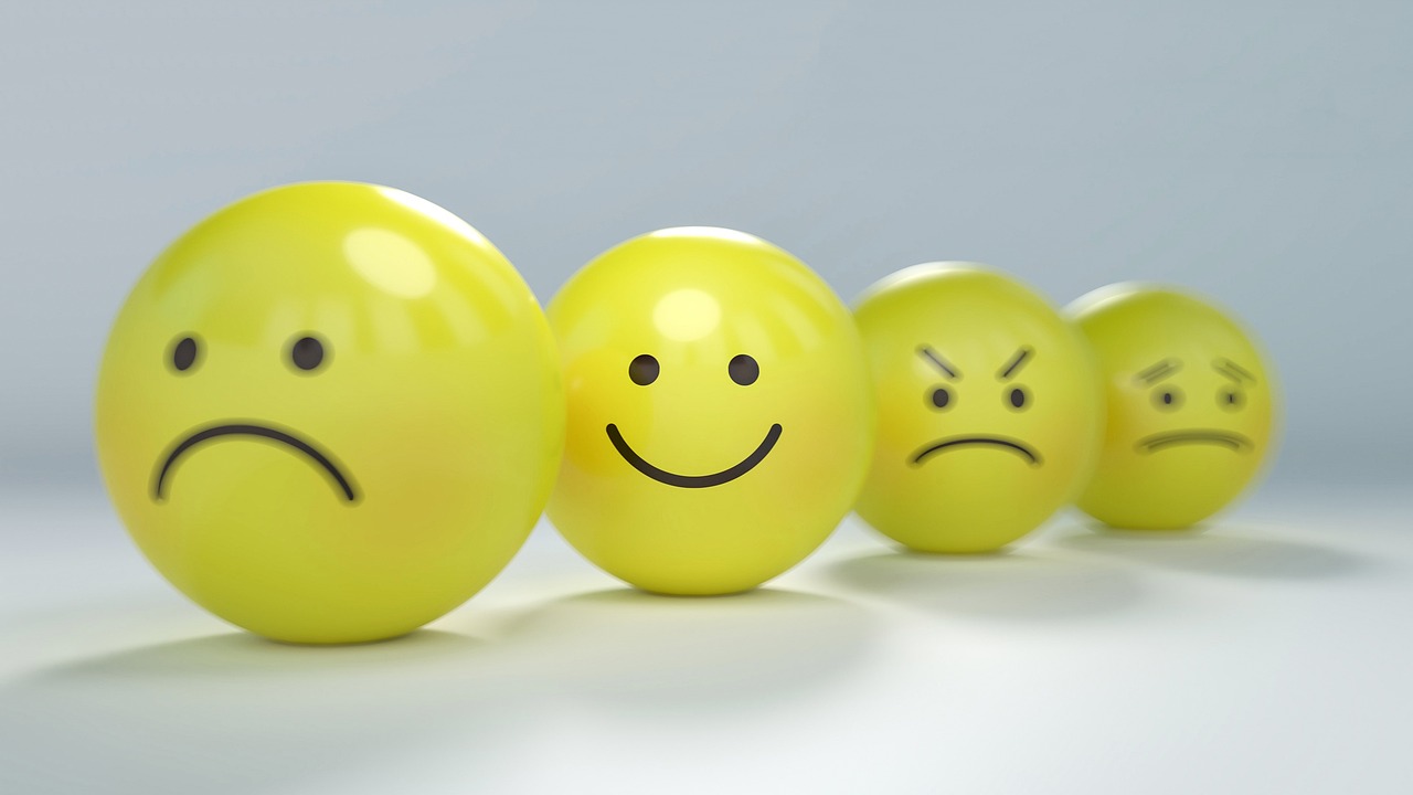
Understanding the Emotional Language of Colors
Each color carries its own psychological signature, evoking specific emotions and mental states. By understanding these associations, you can strategically incorporate colors into your environment to support your emotional and psychological needs.
Red: The Color of Energy and Passion ❤️
Red is perhaps the most stimulating color in the spectrum. It increases heart rate, creates a sense of urgency, and can even enhance physical performance. This powerful hue is associated with passion, excitement, and boldness. In interior spaces, red can be overwhelming if overused, but strategic touches can energize a room and stimulate conversation.
When you need motivation for a workout or want to create an atmosphere of excitement, incorporating red elements can provide that psychological boost. However, avoid excessive red in spaces meant for relaxation or concentration, as it can increase anxiety and restlessness.
Blue: The Universal Calming Agent
Blue is consistently rated as the world’s favorite color, and for good reason. It lowers blood pressure, reduces anxiety, and promotes feelings of security and trust. Light blues evoke the serenity of clear skies and calm waters, making them ideal for bedrooms and meditation spaces.
Darker blues convey professionalism and reliability, which is why so many corporate logos feature this color. If you’re seeking to create a peaceful environment or enhance focus during mentally demanding work, blue is your ally. Studies have shown that people are more productive in blue rooms compared to other color schemes.
Yellow: Sunshine for Your Mind ☀️
Yellow radiates positivity, optimism, and mental clarity. This cheerful color stimulates the nervous system, enhances memory, and encourages communication. Soft yellows can brighten a space without overwhelming it, while bold yellows create an energetic, creative atmosphere.
However, bright yellow in large quantities can cause eye strain and even increase feelings of frustration in some people. The key is balance—using yellow as an accent color to inject warmth and happiness without creating visual fatigue.
Green: Nature’s Balancing Force 🌿
Green sits at the center of the visible spectrum and represents balance and harmony. It’s the color most associated with nature, growth, and renewal. Green has a restorative effect on the eyes and mind, making it excellent for spaces where you spend extended periods.
This color reduces stress, promotes concentration, and can even speed up healing processes. Whether you incorporate green through plants, paint, or décor elements, you’re bringing a sense of equilibrium and natural vitality into your space.
Purple: The Creative and Spiritual Shade
Purple combines the stability of blue with the energy of red, creating a color associated with creativity, luxury, and spiritual awareness. Lighter purples like lavender promote calmness and can even help with insomnia, while deeper purples stimulate imagination and problem-solving abilities.
Throughout history, purple has been linked to royalty and wisdom. In modern applications, it’s particularly effective in creative spaces where you want to encourage innovative thinking and artistic expression.
Orange: Warmth and Enthusiasm 🧡
Orange is friendly, approachable, and energizing without the intensity of red. It stimulates social interaction, increases enthusiasm, and can even stimulate appetite—which is why it’s popular in restaurant design. Orange promotes a sense of comfort and warmth, making it ideal for social spaces.
This color is particularly effective for combating feelings of isolation or depression, as it encourages positive social connections and emotional warmth.
Transforming Your Mood Through Strategic Color Choices
Now that you understand the emotional language of colors, you can deliberately use them to influence your daily mood and mental state. The beauty of color psychology is that small changes can produce significant results.
Creating a Morning Routine with Color
Start your day surrounded by energizing colors. If your morning routine includes exercise, wearing red or orange workout clothes can enhance motivation and physical performance. In your kitchen or breakfast area, incorporate warm yellows and oranges to promote alertness and positive energy as you begin your day.
Even something as simple as choosing a vibrant coffee mug in an energizing color can subtly shift your morning mindset toward productivity and optimism.
Workplace Color Strategies for Peak Performance
Your work environment significantly impacts productivity and creativity. If you have control over your workspace design, consider the nature of your work when selecting colors. For analytical tasks requiring sustained concentration, blues and greens provide the calm focus needed for deep work.
Creative professionals benefit from incorporating purple and orange accents to stimulate imagination and innovative thinking. If your job involves frequent collaboration and communication, warm colors like coral or peach can facilitate better interpersonal interactions.
Evening Wind-Down Color Techniques
As day transitions to night, your color environment should support relaxation and restoration. Dim the bright, stimulating colors and embrace softer, cooler hues. Light blues, lavenders, and soft greens signal to your brain that it’s time to wind down.
Consider using amber or warm-toned lighting in the evening, as blue-spectrum light can interfere with melatonin production and disrupt sleep patterns. Creating a color transition from day to night supports your natural circadian rhythms.
Boosting Creativity Through Color Intelligence
Creativity thrives in environments that stimulate without overwhelming. Color plays a crucial role in setting the stage for innovative thinking and artistic expression.
The Creative Color Palette
Research suggests that exposure to green can enhance creative performance, possibly because it subconsciously connects us to growth and new possibilities. Purple, with its association with imagination and unconventional thinking, also supports creative endeavors.
Many artists and designers find that surrounding themselves with a diverse color palette—rather than a monochromatic scheme—provides visual stimulation that sparks new ideas. However, the key is intentional variety rather than chaotic clutter.
Color Blocking for Mental Clarity
When facing creative blocks, try the color blocking technique. Surround yourself with a single, carefully chosen color for a dedicated period. This focused color immersion can reset your mental state and provide fresh perspective on creative challenges.
Experiment with different colors on different days to discover which hues unlock your personal creative flow. Keep notes on how various colors affect your ideation process and quality of creative output.
Practical Applications: Room-by-Room Color Psychology Guide
Applying color psychology throughout your home creates a supportive environment tailored to different activities and needs.
Bedroom: Your Personal Sanctuary 😴
The bedroom should promote rest and intimacy. Soft blues, gentle greens, and muted lavenders are ideal base colors. Avoid stimulating reds and bright yellows in large quantities. If you want warmth, opt for dusty rose or soft terracotta rather than vibrant hues.
Consider the psychological impact of colors you see first thing in the morning and last thing at night. These colors significantly influence your sleep quality and how you start each day.
Kitchen: The Heart of the Home
Kitchens benefit from warm, appetizing colors. Yellows, oranges, and warm reds stimulate appetite and create a welcoming atmosphere for gathering. These colors also promote conversation and social connection, making them perfect for the communal nature of kitchen spaces.
However, if you’re trying to manage portion control or reduce snacking, consider cooler tones like blue or green, which are naturally appetite-suppressing.
Home Office: Your Productivity Hub 💼
For home offices, prioritize colors that enhance focus and reduce mental fatigue. Blue remains the top choice for sustained concentration. Green provides a balanced environment that reduces eye strain during long screen sessions.
Add yellow accents to stimulate creative problem-solving and maintain mental alertness. Avoid overwhelming patterns or overly stimulating color combinations that create visual distraction.
Living Room: The Social Center
Living rooms should balance relaxation with social energy. Warm neutrals provide a versatile foundation, while accent colors can be adjusted seasonally to create different moods. Earthy tones promote grounding and comfort, while pops of blue or green maintain a sense of calm during social gatherings.
Color Psychology in Fashion and Personal Presentation
The colors you wear don’t just affect how others perceive you—they influence your own self-perception and behavior. This phenomenon, called “enclothed cognition,” demonstrates that our clothing choices have genuine psychological effects.
Dressing for Confidence and Success
Wearing power colors like deep blue, black, or burgundy can enhance feelings of authority and competence. These colors are perceived as professional and commanding, but they also influence the wearer’s mindset, promoting self-assurance and decisiveness.
For presentations or important meetings, navy blue conveys trustworthiness and competence, while a pop of red (a tie, scarf, or accessory) adds energy and commands attention without overwhelming.
Color Choices for Different Emotional Needs
On days when you need an emotional boost, reach for warm, bright colors. Yellow and orange clothing can elevate your mood and increase approachability. When you need to feel grounded and calm, earth tones and soft greens provide psychological stability.
If you’re feeling anxious or overwhelmed, wearing blue can help regulate your nervous system and promote inner calm throughout the day.
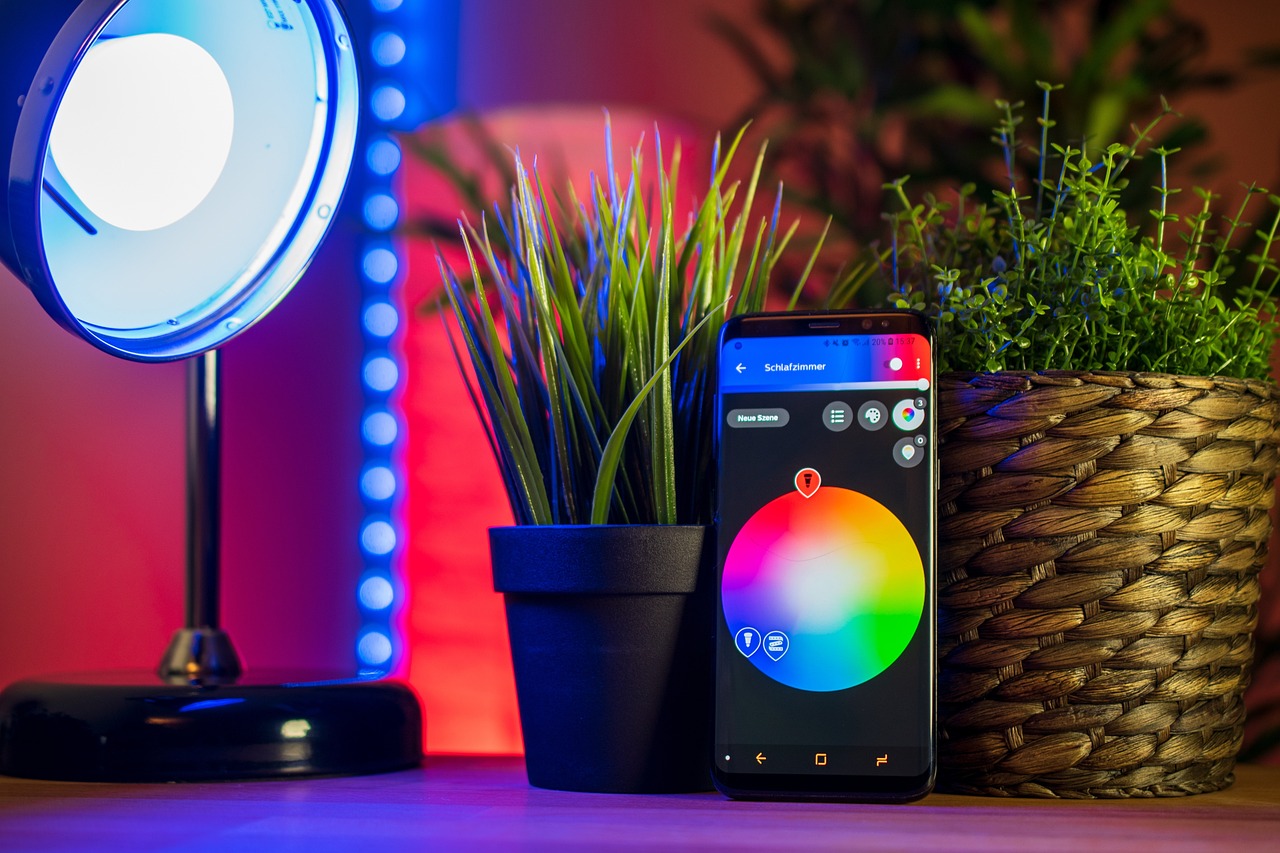
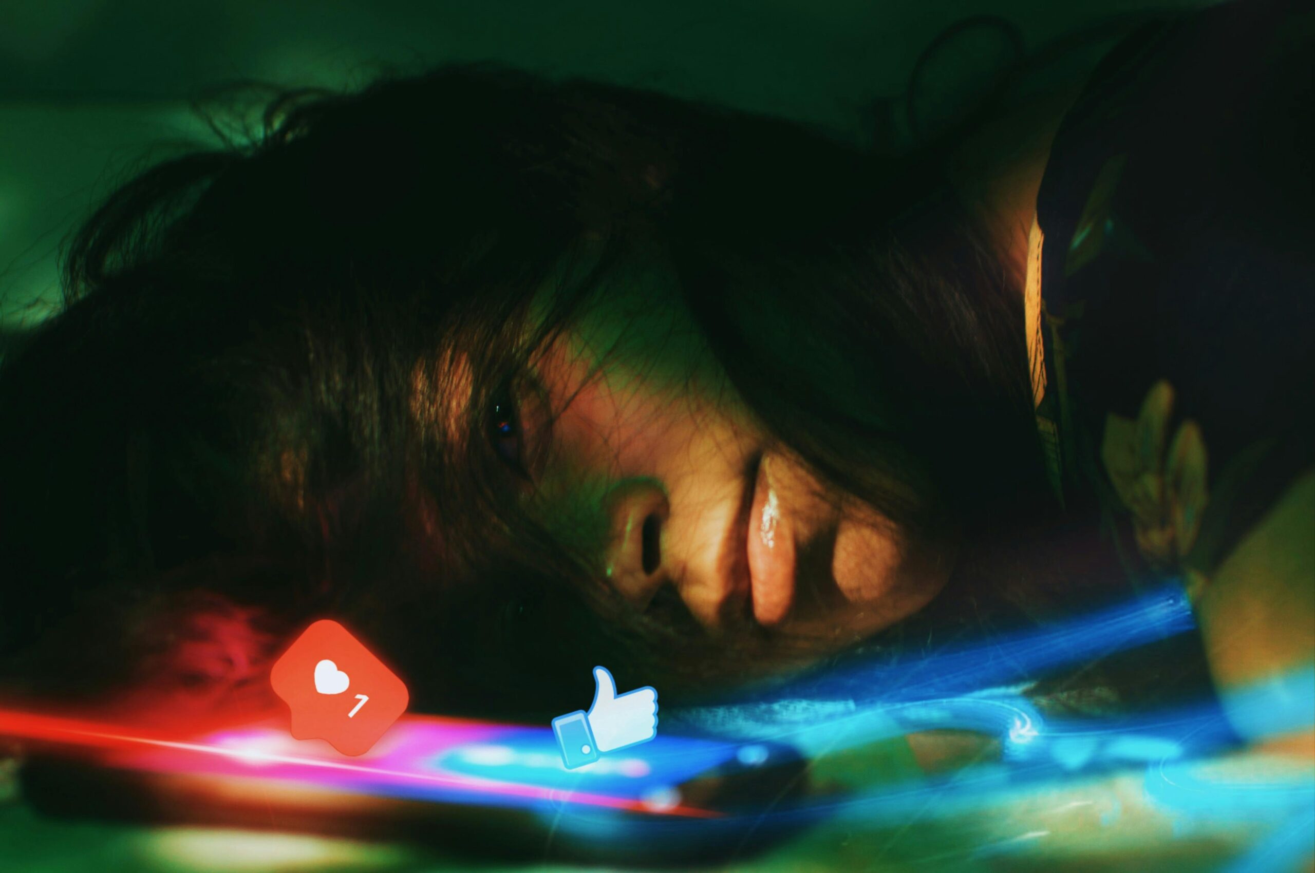
Digital Spaces: Color Psychology in the Virtual World 📱
In our increasingly digital lives, the colors on our screens significantly impact our psychological state. Many people spend hours daily looking at computer monitors, phones, and tablets, making digital color choices particularly important.
Optimizing Your Digital Environment
Consider the background colors of frequently used applications and websites. Dark modes with reduced blue light can ease eye strain and support better evening screen use. However, during daytime work, lighter backgrounds with appropriate contrast support alertness and reduce errors.
Many productivity apps now incorporate color psychology principles into their design. Task management applications often use color coding to help users prioritize and categorize work, leveraging our natural psychological responses to different hues.
Seasonal Color Adjustments for Year-Round Wellbeing 🍂
Just as nature changes colors with the seasons, adjusting your personal color environment throughout the year can support your psychological needs during different climatic periods.
Winter: Combating Seasonal Affective Disorder
During darker winter months, incorporate warmer, brighter colors to compensate for reduced natural light. Yellows, warm oranges, and coral tones can help combat the psychological effects of seasonal darkness and maintain mood stability.
Summer: Cooling Down Psychologically
In hot summer months, cooler color palettes create psychological relief. Blues, greens, and soft purples not only look refreshing but actually help you feel cooler by association with water, sky, and shade.
Creating Your Personal Color Psychology Action Plan
To truly harness the power of color in your life, develop a personalized approach based on your unique needs, preferences, and goals.
Step One: Assess Your Current Color Environment
Take inventory of the dominant colors in your key environments—home, workspace, wardrobe. Notice how these colors make you feel. Are there spaces where you feel particularly energized or drained? Identify connections between color schemes and your emotional responses.
Step Two: Identify Your Psychological Needs
What aspects of your life need support? Do you struggle with morning motivation? Experience afternoon energy crashes? Feel anxious in social situations? Have difficulty unwinding in the evening? Match these needs with appropriate color solutions.
Step Three: Implement Gradual Changes
You don’t need to repaint your entire home or buy a new wardrobe. Start with small, strategic color additions. A new throw pillow, a piece of artwork, a colorful planner, or even fresh flowers can shift the energy of a space. Notice the effects before making larger commitments.
Step Four: Track and Adjust
Keep a simple journal noting color changes you make and any shifts in mood, productivity, or wellbeing. Color psychology is somewhat individual—while general principles apply broadly, your personal responses may vary. Fine-tune your approach based on your experiences.
Beyond Simple Color Choices: Saturation and Brightness Matter Too 🎨
It’s not just the hue that matters—saturation (color intensity) and brightness (lightness or darkness) significantly impact psychological effects. A muted, dusty blue creates a very different feeling than a bright, vivid blue, even though they’re technically the same color.
Highly saturated, bright colors are stimulating and attention-grabbing but can become overwhelming quickly. Muted, desaturated colors tend to be more calming and easier to live with long-term. Consider using vibrant colors as accents and more subdued tones as foundational elements in your spaces.
The Transformative Potential of Color Awareness
Understanding and applying color psychology isn’t about rigid rules or dramatic transformations. It’s about developing awareness of the subtle yet powerful ways color influences your daily experience and making intentional choices that support your wellbeing.
Small adjustments to your color environment can create ripple effects throughout your life. Better mood leads to improved relationships. Enhanced focus increases productivity. Greater creativity opens new possibilities. These benefits compound over time, making color psychology one of the most accessible and effective tools for personal development.
As you begin incorporating these insights, remember that you’re working with a powerful psychological tool that humans have responded to for millennia. Trust your instincts, experiment with different approaches, and pay attention to how colors make you feel. Your relationship with color is deeply personal, and developing this awareness is a form of self-knowledge that pays dividends in every area of life.
The power to transform your mood, boost your creativity, and enhance your overall quality of life is literally all around you, waiting to be recognized and harnessed. Start today with one small color change, and watch as this simple shift begins to influence your psychological landscape in profound and lasting ways. 🌈