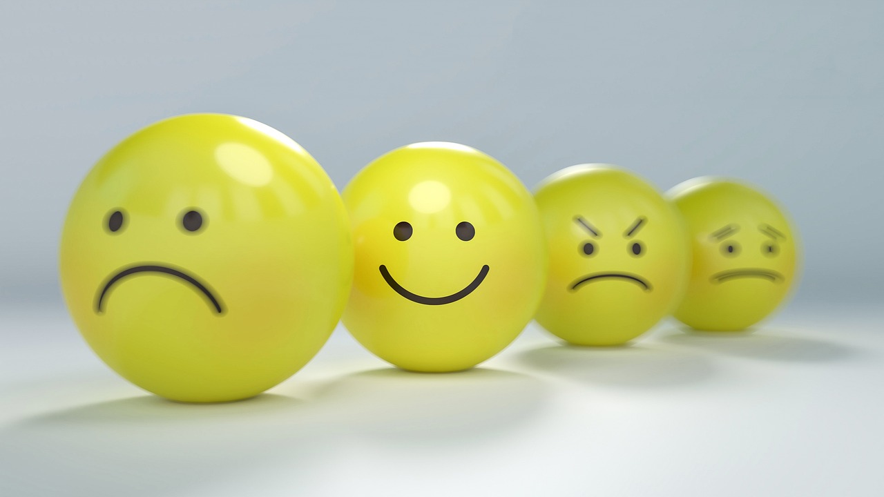
Imagine walking into a room and instantly feeling energized, focused, or calm. This isn’t magic—it’s the science of color psychology at work in your environment. The colors surrounding you have a profound impact on your mental state, productivity levels, and overall wellness.
Color-coded environments represent a revolutionary approach to interior design and workspace optimization. By strategically implementing specific colors in different areas of your life, you can create spaces that support your goals, enhance your mood, and boost your performance. Whether you’re redesigning your home office, refreshing your bedroom, or reimagining your entire living space, understanding how to harness the power of color can transform not just your surroundings, but your entire daily experience.
🎨 The Science Behind Color Psychology and Human Behavior
Color psychology isn’t just interior design folklore—it’s backed by decades of scientific research. Studies have consistently shown that different wavelengths of light trigger specific neurological responses in our brains. When we perceive color, our eyes transmit signals to the hypothalamus, which then sends messages throughout our body affecting hormones, mood, and even physiological functions like heart rate and blood pressure.
Research published in environmental psychology journals demonstrates that exposure to certain colors can increase productivity by up to 20%. Blue tones, for instance, have been shown to enhance creative thinking and problem-solving abilities, while red can increase attention to detail and physical performance. These aren’t subtle effects—they’re measurable changes in human behavior and cognition.
The impact of color extends beyond immediate reactions. Prolonged exposure to specific color environments can create lasting associations and habitual responses. This is why hospitals use soft greens and blues, why restaurants often incorporate warm reds and oranges, and why tech companies favor neutral tones with vibrant accent colors.
🔵 Blue Zones: Creating Spaces for Focus and Calm Productivity
Blue is perhaps the most universally beneficial color for workspaces and productivity zones. This cool tone has been scientifically proven to lower blood pressure, reduce heart rate, and promote a sense of calm focus. When you’re working on complex tasks that require sustained concentration, blue environments can be your secret weapon.
Consider implementing blue in your home office, study areas, or anywhere you need to engage in deep work. Navy blues create sophisticated, serious atmospheres perfect for analytical tasks, while lighter sky blues foster creativity and open thinking. Turquoise shades combine the calming effects of blue with the renewal qualities of green, making them ideal for brainstorming spaces.
The key to blue environments is balance. Too much blue can feel cold or depressing, especially in spaces without natural light. Combine blue walls or furniture with warm wood tones, brass fixtures, or touches of warmer accent colors to create an inviting yet focused atmosphere.
Implementing Blue in Your Workspace
You don’t need to paint entire rooms to benefit from blue’s productivity-enhancing effects. Strategic implementation can be just as powerful. Consider blue desk accessories, artwork featuring blue tones, or even blue lighting filters. Some professionals swear by blue-light therapy lamps positioned near their workspace to maintain alertness during afternoon energy dips.
🟢 Green Environments: The Balance Point for Wellness and Restoration
Green sits at the center of the visible light spectrum, making it the most restful color for human eyes. This isn’t coincidental—our ancestors spent millennia in green natural environments, and our biology still responds positively to these tones. Green spaces promote balance, restoration, and a sense of renewal that’s essential for long-term wellness.
Incorporating green into your environment can significantly reduce eye strain, especially important for those spending hours in front of screens. Studies show that even brief exposure to green environments can restore depleted attention and reduce mental fatigue. This makes green ideal for spaces where you need sustained performance without burnout.
Consider green for meditation rooms, reading nooks, or transitional spaces like hallways and entryways. Sage greens create sophisticated, calming atmospheres, while vibrant emerald tones energize without overwhelming. Forest greens ground spaces and connect us to nature, even when we’re indoors.
Bringing Nature’s Palette Indoors
Beyond paint colors, incorporating actual plants amplifies green’s beneficial effects. Living greenery not only provides color but also improves air quality and creates dynamic visual interest. Combine painted green elements with strategic plant placement for maximum wellness impact.
🔴 Red Zones: Energizing Spaces for Action and Engagement
Red is the most physiologically stimulating color in the spectrum. It literally increases heart rate, blood pressure, and adrenaline production. This makes it powerful but requires careful application. Used strategically, red can transform spaces meant for physical activity, social interaction, or high-energy work.
Fitness areas, dining rooms, and entertainment spaces benefit most from red tones. In dining areas, red has been shown to stimulate appetite and encourage conversation—one reason many restaurants incorporate it into their design. For home gyms or workout spaces, red can boost motivation and physical performance.
However, red’s intensity means moderation is crucial. Too much red in spaces where you need to relax or focus can create anxiety and restlessness. Consider red as an accent color rather than a dominant theme, or use softer versions like coral, terracotta, or burgundy for more subtle energy boosts.
🟡 Yellow Spaces: Cultivating Optimism and Creative Energy
Yellow is the color of sunshine, and it brings similar effects indoors—warmth, optimism, and mental stimulation. This cheerful hue can transform dark or rarely-used spaces into inviting areas that boost mood and encourage creative thinking. Yellow stimulates mental activity and generates muscle energy, making it excellent for creative studios, kitchens, and social areas.
Light, buttery yellows create welcoming atmospheres without overwhelming the senses. Brighter yellows work well as accent colors or in spaces with abundant natural light. Golden yellows add sophistication while maintaining warmth, perfect for dining areas or living rooms where you want to foster connection and conversation.
One caution with yellow: studies suggest that babies cry more and tempers flare faster in bright yellow environments. If you’re drawn to yellow but want to avoid potential overstimulation, opt for muted or cream-based yellows rather than intense, pure hues.
⚪ Neutral Foundations: The Canvas for Intentional Color Coding
While vibrant colors create specific effects, neutrals form the essential foundation of any well-designed color-coded environment. Whites, grays, beiges, and blacks provide visual rest and allow accent colors to shine without creating sensory overload. Neutral spaces feel clean, spacious, and adaptable—qualities essential for long-term satisfaction with your environment.
The trend toward Scandinavian and minimalist design highlights neutrals’ psychological benefits. These palettes reduce visual clutter, decrease decision fatigue, and create calm backgrounds for daily life. When your walls, floors, and major furniture pieces are neutral, you can easily adjust the mood and function of spaces by changing accent colors through pillows, artwork, or accessories.
Different neutrals create distinct atmospheres. Warm grays and beiges feel cozy and grounding, while cool grays and whites create crisp, modern environments. Black, used strategically, adds drama and sophistication while helping other colors pop visually.
🎯 Creating Your Color-Coded Environment Strategy
Transforming your space with color coding requires intentional planning. Start by auditing your current environment and identifying how each space makes you feel. Do you struggle with focus in your office? Feel uninspired in your creative space? Have trouble winding down in your bedroom? These challenges point to opportunities for color intervention.
Mapping Functions to Colors
Create a simple map matching your spaces to their primary functions, then assign appropriate color schemes. This strategic approach ensures consistency and maximizes the psychological benefits of your color choices. Consider these evidence-based pairings:
- Deep work and concentration: Blues, teals, and blue-greens
- Creative thinking and brainstorming: Light blues, yellows, and orange accents
- Physical activity and motivation: Reds, oranges, and vibrant accent colors
- Relaxation and sleep: Soft blues, greens, lavenders, and warm neutrals
- Social interaction and dining: Warm reds, oranges, yellows, and earth tones
- Meditation and mindfulness: Greens, soft blues, and natural neutrals
Implementation Without Overwhelm
You don’t need to repaint your entire home to benefit from color coding. Start with one space and experiment with the psychological effects before expanding. Even small changes like swapping throw pillows, adding colorful artwork, or changing lighting can create noticeable shifts in how a space feels and functions.
For renters or those hesitant about permanent changes, removable options include peel-and-stick wallpaper, temporary wall decals, colorful textiles, adjustable lighting systems, and strategically placed furniture and accessories. These approaches allow you to test color schemes and adjust based on your personal response.
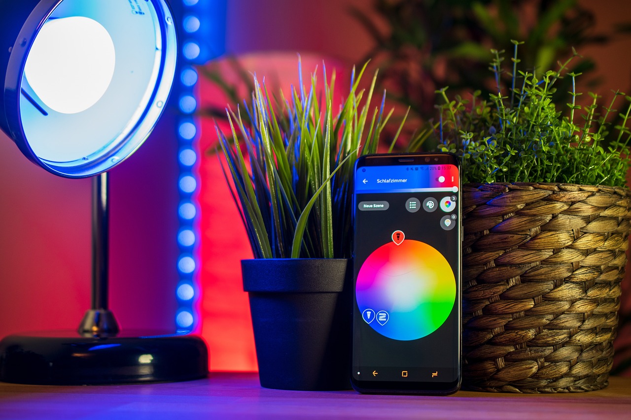
💡 Lighting: The Often-Overlooked Color Variable
Lighting dramatically affects how we perceive and experience color. The same paint color can feel energizing under cool daylight bulbs or cozy under warm incandescent lighting. Smart lighting systems now allow you to adjust color temperature throughout the day, supporting your circadian rhythm and matching your activities.
Cool, blue-toned lighting (5000K-6500K) mimics midday sunlight and promotes alertness—ideal for workspaces during morning and afternoon hours. Warm, amber-toned lighting (2700K-3000K) mimics sunset and encourages relaxation, perfect for evening hours in living spaces and bedrooms. Adjustable systems let you optimize lighting for both function and mood.
Natural light remains the gold standard. Maximize daylight in your most-used spaces and consider how your color choices interact with available natural light. Rooms with north-facing windows benefit from warmer colors to counteract cool natural light, while south-facing rooms can handle cooler color palettes without feeling cold.
🧘 Personal Response: Why Your Color Experience Matters Most
While color psychology provides evidence-based guidelines, individual responses vary based on personal associations, cultural background, and unique neurological factors. A color that energizes one person might overwhelm another. The most successful color-coded environments balance psychological research with personal preference and response.
Test colors before committing to major changes. Paint large poster boards with your chosen colors and live with them in the intended space for several days. Notice how the color makes you feel at different times of day and in different lighting conditions. Your visceral response provides valuable data that no study can replace.
Keep a journal tracking your mood, productivity, and energy levels as you experiment with different color environments. Over time, patterns will emerge that help you refine your approach and create spaces perfectly calibrated to your needs.
🏠 Room-by-Room Color Coding for Maximum Impact
Applying color psychology effectively means tailoring your approach to each space’s unique function. Your bedroom serves different purposes than your kitchen, and their color schemes should reflect these distinctions.
The Productivity-Focused Home Office
Base your workspace on blues for focus and concentration. Add green elements to reduce eye strain during long work sessions. Use warm wood tones and brass or copper accents to prevent the space from feeling cold. Consider a energizing accent color like coral or yellow in small doses—perhaps in artwork or a desk accessory—to spark creativity during brainstorming sessions.
The Restorative Bedroom Sanctuary
Prioritize relaxation with soft blues, gentle greens, or warm neutrals. Avoid stimulating reds and bright yellows that can interfere with sleep. Layer different shades of your chosen color for depth without complexity. Consider black-out curtains in neutral tones to eliminate light pollution while maintaining your color scheme.
The Social Heart: Living and Dining Areas
Warm, welcoming colors encourage connection and conversation. Terracotta, warm reds, golden yellows, and rich oranges create inviting atmospheres. Balance intensity with neutral foundations and use vibrant colors as accents rather than overwhelming dominant themes. These spaces benefit from adjustable lighting to shift mood from energetic social gatherings to relaxed family time.
🔄 Seasonal Adjustments: Keeping Your Environment Dynamic
Just as nature changes with seasons, your color environment can evolve to match shifting needs and external conditions. Summer might call for cooler blues and greens to create psychological relief from heat, while winter benefits from warmer tones that counteract short, dark days.
Implementing seasonal color shifts doesn’t require repainting. Swap textiles like throw pillows, blankets, and curtains. Rotate artwork featuring different color palettes. Adjust lighting temperature to complement seasonal moods. These simple changes keep your environment fresh and responsive to your evolving needs.
🌟 Maintaining Your Color-Coded Environment for Long-Term Benefits
Creating a color-coded environment isn’t a one-time project—it’s an ongoing practice of attention and adjustment. As your life circumstances change, your spaces should evolve with you. A home office that served you well during one project phase might need color adjustments as your work shifts to different types of tasks.
Schedule quarterly reviews of your spaces. Ask yourself: Does this environment still support my goals? Have my needs changed? Am I experiencing the intended effects? This regular reflection ensures your color choices continue serving you rather than becoming invisible background elements you no longer notice.
Document what works through photos and notes. When you discover particularly effective color combinations or placement strategies, record them. This personal database becomes increasingly valuable as you refine your approach and eventually helps you make confident decisions about new spaces.
🚀 Taking Action: Your First Steps Toward Transformation
The gap between understanding color psychology and experiencing its benefits lies in implementation. Start small but start today. Choose one space that frustrates you or fails to support your goals. Identify the primary function of that space and select an appropriate color palette based on the principles outlined here.
Invest in a few key pieces—perhaps new throw pillows, a piece of artwork, or even just a gallon of paint for an accent wall. Live with the change for at least two weeks, paying attention to shifts in your mood, productivity, or behavior in that space. Use this experience as a foundation for more extensive color-coding throughout your environment.
Remember that creating supportive, intentional environments is a form of self-care. The colors surrounding you aren’t trivial decorating decisions—they’re powerful tools that shape your daily experience, influence your mental state, and impact your overall quality of life. By transforming your space through strategic color coding, you’re investing in your productivity, protecting your wellness, and creating a home that truly serves you.
Your environment shapes you, but you also shape your environment. Take control of this powerful reciprocal relationship, and watch as the spaces you inhabit begin to actively support your best life. The transformation starts with a single color choice in a single room—and extends to every aspect of how you live, work, and thrive in your daily life. 🎨